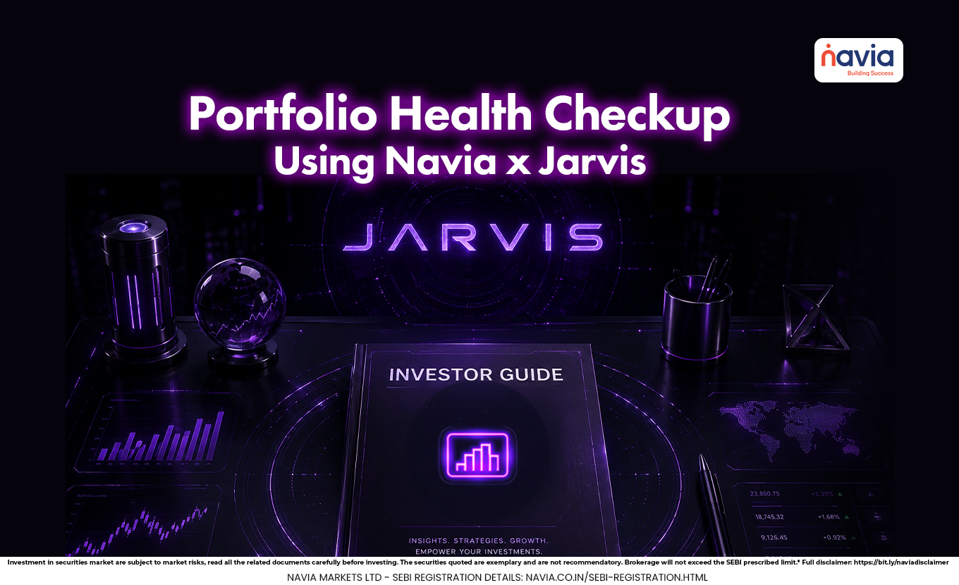
Investor’s Guide: Using Navia and Jarvis for Portfolio Insights
- How To Access it?
- Key Portfolio Metrics
- What You Can Find in the Report?
- KYC For Unlocking Reports
- Conclusion
- Frequently Asked Questions
A portfolio is not about returns; it should also tell you how well your investments are balanced, how much risk you are taking, and whether your money is spread across the different asset categories. That is exactly what a portfolio health check is used to access.
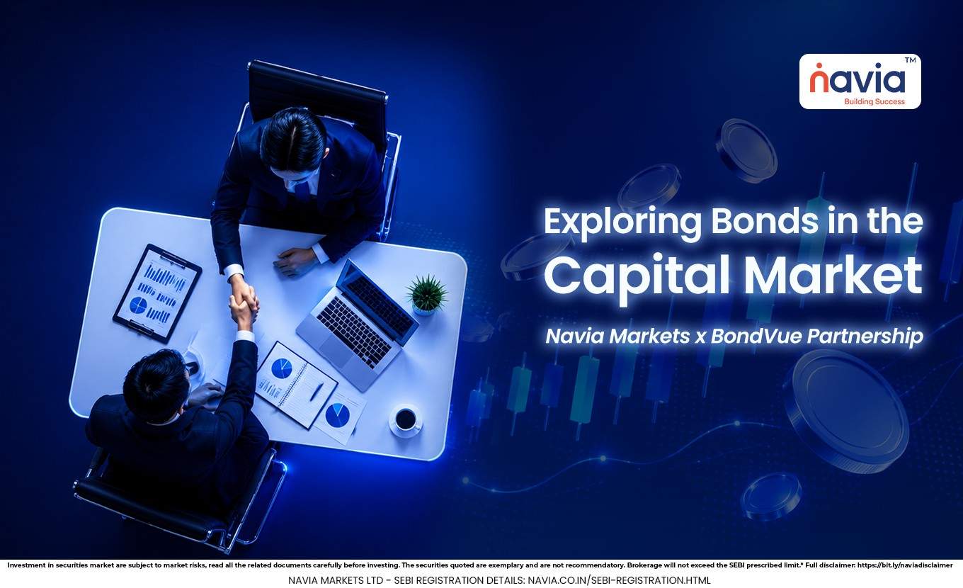
Through Navia’s partnership with Jarvis, users can now access a portfolio health check available within the app. The report gives a structured view of portfolio value, returns, risk, liquidity, diversification, and performance in one place.
How To Access it?
To begin, open the Navia All-in-One App and log in. Then go to the Tools section and select Portfolio Health Check.
You will be redirected to the Jarvis page, where the dashboard starts with key figures such as invested value from one year ago, current value, returns, number of stocks, and portfolio beta. These first numbers give an overview of historical portfolio data.
Key Portfolio Metrics
The report highlights several important metrics that help you judge the quality of your portfolio.
🔸 Sharpe Ratio: Shows how well the portfolio performs compared with the risk taken. A higher Sharpe Ratio generally indicates higher risk-adjusted return relative to lower values.
🔸 Calmar Ratio: Compares annualized returns with maximum drawdowns. A higher value reflects return relative to risk levels.
🔸 Annual Volatility: Shows how much your portfolio moves over a year. Higher volatility means larger ups and downs.
🔸 Sortino Ratio: Measures return relative to downside risk only. A higher ratio usually means the portfolio measures downside risk-adjusted returns.
🔸 Daily Value at Risk: Estimates the maximum potential loss in a day under normal market conditions. It estimates potential short-term downside exposure.
What You Can Find in the Report?
Holdings and Diversification
The report also shows how your holdings are distributed through a pie chart. This shows whether your money is concentrated in a few stocks or spread across several holdings.
You can also view sector diversification with a legend on the side. Hovering over the legend, highlights each sector and the percentage invested in it, indicating where most of your capital is concentrated.
Top Gainers and Losers
Another useful section is the chart that shows the top losers and top gainers in your holdings. Orange represents losers, while green represents gainers.
This view shows which stocks are supporting your portfolio and which ones may require further review. It is a simple but effective way to track short-term movement inside the overall portfolio.
Liquidity And Market Cap
The liquidity synopsis helps you understand how easily your investments can be converted into cash during emergencies or uncertain market periods. It separates liquid and illiquid holdings, so you can see whether your portfolio may require selling under less favorable conditions.
The report also shows market cap diversification across small-cap, mid-cap, and large-cap holdings. This is important because different market cap segments behave differently in different market conditions.
Risk And Tail Stocks
The risk section categorizes holdings into high, medium, and low risk. This helps you see whether your portfolio is high-risk, low-risk allocation, or reasonably balanced.
You will also see zero percent tail stocks, which are holdings designed to act as more stable or protective assets during extreme market stress. These are useful to understand because they can reduce impact during market stress rather than amplify them.
Performance View
The report includes return summaries for top sectors and bottom sectors, along with a performance chart comparing your portfolio against the Nifty 50 over the past year. This allows comparison with benchmark indices than the broader market.
You also get access to deeper sections such as stock allocation, sector analytics, portfolio profiling, risk, liquidity, and performance after completing KYC. This gives users a more detailed portfolio breakdown instead of just a surface-level summary.
Portfolio Summary
The stock allocation section shows how investments are spread across stocks, sectors, and asset classes. This shows diversification and allocation.
The sector analytics section shows whether a portfolio is overexposed or underexposed to certain sectors. The portfolio profiling section highlights risk rating and concentration, while the risk, liquidity, and performance sections show whether adjustments may be considered in those areas.
KYC For Unlocking Reports
To unlock the full set of reports, you must complete the KYC. Tap Unlock, enter your PAN details and date of birth, upload your PAN card, and update your Aadhaar details.
You will also need to upload the front and back of your Aadhaar card. The file size must be below 2MB. After submission and successful validation, detailed reports become available.
Conclusion
A portfolio health check is used to assess not just how much they earned, but also how healthy their overall portfolio really is. It brings together risk, return, diversification, liquidity, and concentration into one structured report.
For investors, this kind of review can assist in identifying areas of concentration or risk, and support investment decision-making. Saving the report for future reference can also help track changes over time.
Do You Find This Interesting?
We’d Love to Hear from you-

Frequently Asked Questions
What is a portfolio health check?
It is a report that is used to evaluate the overall quality, balance, risk, and performance of their portfolio.
Where can I find the portfolio health check in Navia?
Open the Navia All-in-One App, go to Tools, and select Portfolio Health Check.
Why is liquidity important?
Liquidity shows how easily you can access cash without being forced to sell investments at a bad time.
What does sector diversification mean?
It shows how your money is distributed across different sectors to reduce concentration risk.
What metrics are included in the report?
The report includes Sharpe Ratio, Calmar Ratio, Annual Volatility, Sortino Ratio, and Daily Value at Risk.
Disclaimer: This is a third-party product/service. Navia acts only as a facilitator/referrer; all services, transactions, KYC, payments, and grievances are handled directly by the provider.