How Pro Traders Use Put-Call Ratio (PCR) Charts to Time Their Option Trades
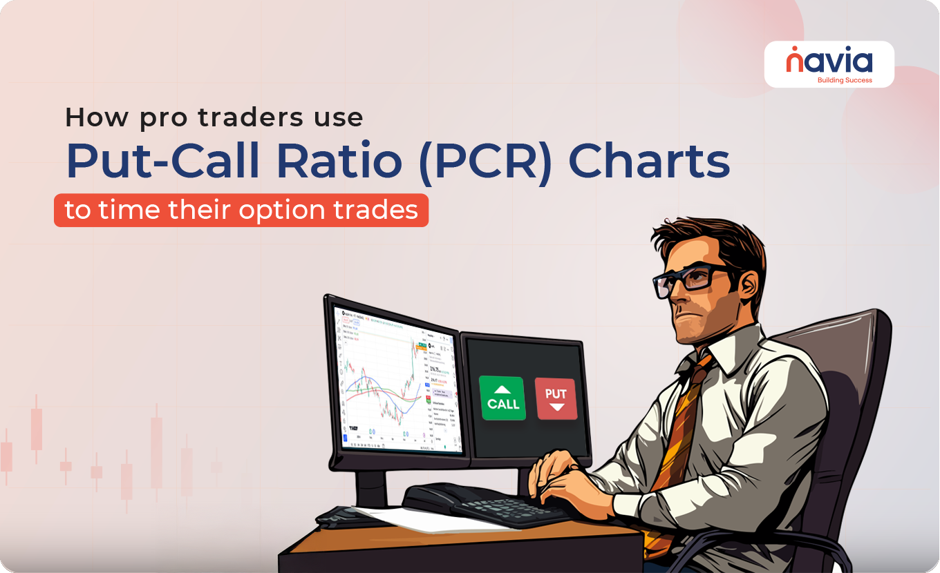
Ask any professional options trader their secret weapon, and they’ll likely mention the Put-Call Ratio (PCR). While most beginners focus only on price and volume, the smart money watches PCR — and more importantly, how it moves over time on a chart.
Let’s break down:
🠖 What is PCR?
🠖 How to chart it?
🠖 And how seasoned traders use it to catch market turns before the crowd?
What is Put-Call Ratio (PCR)?
At its core, PCR = Total Put Open Interest ÷ Total Call Open Interest
🠖 A PCR > 1 = More puts than calls → Bearish bets dominate
🠖 A PCR < 1 = More calls than puts → Bullish bets dominate
But this number by itself isn’t enough. The real insight comes from how PCR changes over time, especially when you chart it.
How to Chart PCR?
You can plot PCR just like a stock price:
1. Collect daily PCR values — either index-wise (like Nifty PCR) or for a specific stock.
2. Use line or area charts to visualize its movement.
3. Overlay it with price charts of the underlying asset.
Many platforms like Navia, Sensibull, offer built-in PCR charting.
How Pros Interpret PCR Charts?
1. Extreme Zones = Reversal Signals
| PCR Value | Market Sentiment | Interpretation |
| > 1.5 | Too bearish | Contrarian signal – possible rally |
| < 0.6 | Too bullish | Complacency – possible correction |
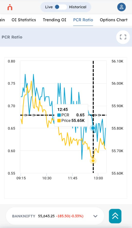
Below is an actual intra-day PCR Chart from Navia All-in-One App on June 19 2025 which shows PCR falling along with the underlying Price. The PCR has fallen from 0.75 levels to 0.6 levels indicating now a possible price correction in the short term though the overall longer trend is Bullish since PCR < 1.
Similarly If Nifty PCR rises to 1.6, it suggests traders are overloaded on puts — i.e., expecting a fall. But this often indicates a bounce is near.
“When everyone’s on one side of the boat — it usually tips.”
2. Divergence Between Price and PCR
🠖 Price Rising + PCR Falling = Traders adding calls → Overconfidence → Caution zone
🠖 Price Falling + PCR Rising = Traders adding puts → Panic → Reversal possible
Look for these divergences on daily or hourly PCR charts — they often lead price action.
3. PCR Trending Up or Down
🠖 Rising PCR trend → Increasing bearish positions
🠖 Falling PCR trend → Growing bullish bets
But context matters: A rising PCR during a downtrend = fear confirming trend
A rising PCR during a flat market = fear peaking = possible bottom

4. Intraday PCR Shifts (Short-Term Traders)
Pros also track real-time PCR on expiry days:
🠖 Sudden drop in PCR = heavy call buying or put unwinding = bullish surge ahead
🠖 Sharp rise in PCR = aggressive put buying = caution or reversal incoming
Useful for scalping or timing short straddles/strangles
How to Use PCR in Your Trading Strategy
Combine PCR with:
🠖 Support/resistance levels
🠖 OI analysis (put/call writing zones)
🠖 Price action
Don’t rely on PCR in isolation — it’s a sentiment gauge, not a buy/sell trigger.
Final Thoughts
🠖 PCR is the heartbeat of options sentiment
🠖 Chart it over time — don’t look at it as just a number
🠖 Look for extremes, divergences, and trend shifts to get ahead of market turns
Professional traders don’t react to headlines — they watch data like PCR for early clues.
Want access to a live PCR dashboard?
Download the All in One Zero Brokerage Navia APP now.
Do You Find This Interesting?
We’d Love to Hear from you-

DISCLAIMER: Investments in securities market are subject to market risks, read all the related documents carefully before investing. The securities quoted are exemplary and are not recommendatory. Full disclaimer: https://bit.ly/naviadisclaimer.